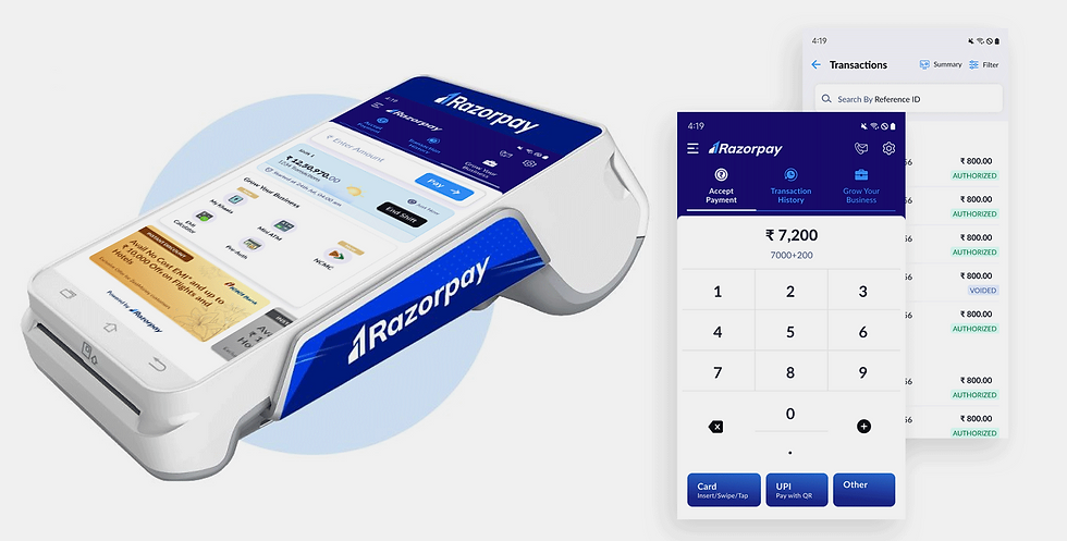
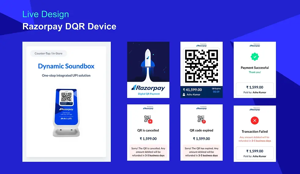
Razorpay POS - Redesign

Context
Razorpay is a financial platform that helps businesses in India accept, process, and disburse payments online.
Razorpay acquired Ezetap, an offline payment company, to establish itself as an omnichannel payment platform.
As a part of the rebranding exercise, I saw an opportunity to improve the offline payment experience.
Problems
Product design strategy
I separated the redesign design work into three phases- each with its important product agendas/metrics to assign to relevant product verticals.
The goal was to operate at parity with competitors in critical features for quick business impact.
These are the 3 phases that were planned.
01
Rebranding of Ezetap to Razorpay.
Time taken from device boot to transaction start. (Improving TAT by 5 seconds)
02
Improving Transaction time for key payment methods (UPI, Debit/Credit Cards).
03
Improving transaction time for affordability (EMI).
1
Number of steps taken to reach transactionx
2
Reduction in the number of login attempts
3
Reduction in login failures
4
Reduction in average login time
5
Reduction in average dashboard loading timert
6
Reduction in-app download failures
7
Number of payments made during app download
8
Improve in-app updates
Output metrics
Design
Interface design
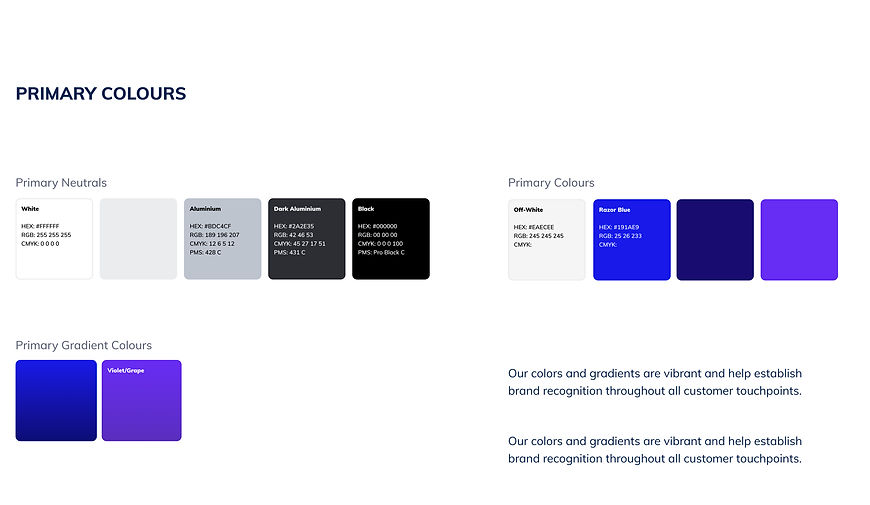
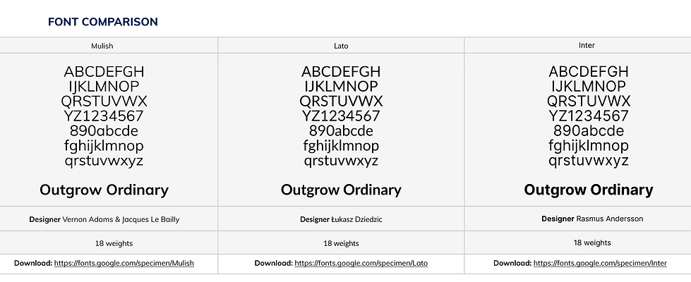
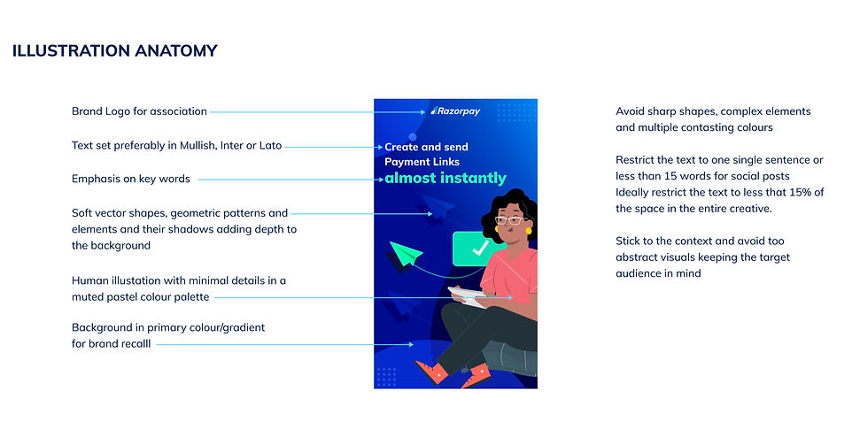
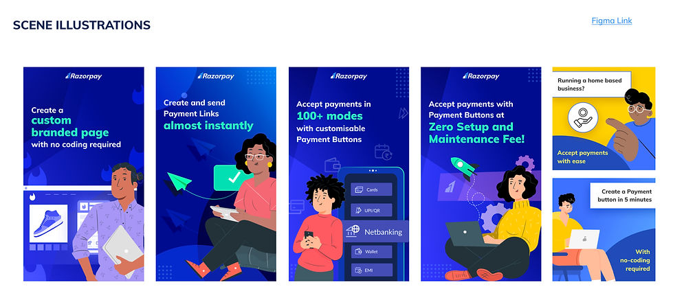
Rebranding

